

Momo Cafe is a small business located in Midtown, Atlanta attached to Momonoki which is a service restaurant on casual Japanese food. I have been there to say that the food, drinks, and ambiance are quite enjoyable. I was wondering how they marketed themselves with Instagram because it was quite busy when I had went. I have picked three social media posts, two of food items posted on the Instagram and a picture of their website. I will be doing my analysis.
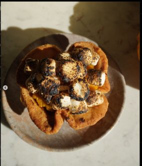
The first post I looked at is of an pumpkin s’mores egg tart image with a pumpkin located in the background of the photo. The image itself is very clear and vibrant with the blurred background ultimately enhancing the food item. The angle of the image is viewed from above and to the side which gives it more depth by looking at this pastry from all sides making it look more appealing. The proximity is right there in front of the audience to see. The burnt of the marshmallow adds texture to the image as well. The caption is hooking people in trying to sell this “ enchanted treat” by using descriptive linguistic words such as, “ swirl of light, sweet, and heavenly magic in every bite”. This is effective because is appealing towards their audience but imagining what that could taste like, “ heavenly”. The hashtags are correlating to the audience of Atlanta as well as people in search of a new cafe to visit. Overall it is engaging and appealing to get the audience excited for the new pastry
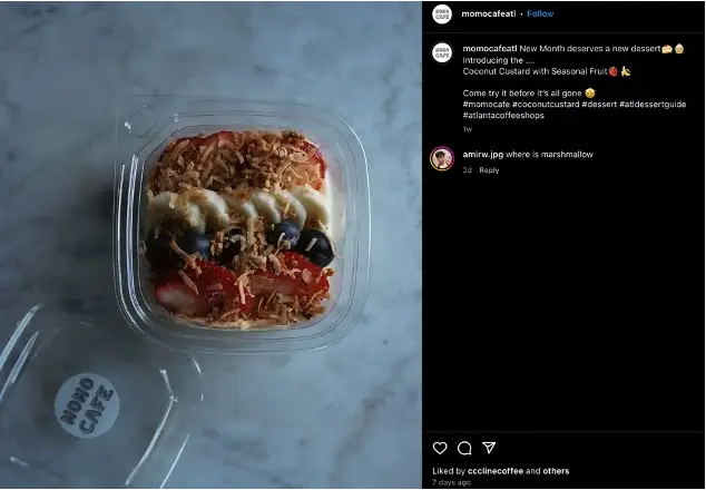
The second post is another food item post, but we can already see that this one is different. It is not as clear as the first one. The layout is angled above to get the whole overall view of the food item. We can see the dangling blurred logo which was on purpose to get their logo shown more. The background is plain granite top, so the audience can just focus on the dessert, but I feel it dulls the image. The lightning is not good, the color contrast is a bit off, but it does highlight the fruit. The linguistic is very similar to the first one in the usage of emojis, but not as descriptive. The hashtags are different as well putting “#momocafe” together instead of separate. I can notice that they did small changes towards a better first image. Their design elements changed because they got a better understanding of their media.We see more interaction with the media in the first post. By separating “momo” and “ cafe” in the hashtags, we get can reach out audience more which are the ones looking for cafes, I think that was a good change.
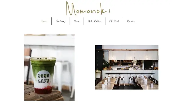
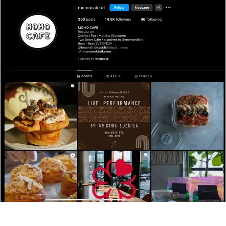
The third social media post was to compare their website and their instagram page. Right off the bat, we notice that the website heading is “ Momonoki”. They did incorporate the logo of Momo Cafe. This is the first time, we see a beverage. Not even in the first six Instagram posts do we see a beverage. I would recommend more pictures of beverages especially on their Instagram. Now the website, it seems they share with Momonoki, but there is still some representation of them within the page. Their instagram should be focusing entirely on their drinks and beverages plus information over events, but it does not do that. Perhaps they want a more sophisticated look as Momonoki does, but the vibrant white bubbled font logo illustrates a fun vibrant genre. While looking at the Instagram, the one thing that felt off was the logo! The alignment on the website and the Instagram is about the same as a justified alignment. They remain consistent throughout both pages. The organization on the website is more focused on photos. If one were to scroll down it, they would see tons of food, drinks, and dinning experience photos. There is nothing else on the first page of the website but the emphasis on their products and experience. The audience finds out who they are throughout the website even going into detail about their logo signifying “Peachtree” using it as a guiding metaphor that was interesting because it connected to the community ( audience) as a whole. In contrast to their Instagram, which showcases more emphasis towards food, and events happening in the space.
Their website ;on the other hand, has a well thought of organization, layout, color contrast perhaps because it is mostly Momonki’s than Momo Cafe’s. For Momo Cafe’s Instagram adding to what I already have said , I would focus more on the color contrast and cohesiveness of each post to correlate to the logo. Focusing on lighting for photos. Incorporating more beverages. I would say some videos , humorous or cute, to really make the cafe stand out.
Add comment
Comments